Showing posts with label painting. Show all posts

Lullabies and a Lick o' Lovely Lavender


I bought my home over 10 years ago, yet it was only this past week that I finally corrected something that had been nagging me all that time... I painted the master bedroom a color I actually like.

Originally, it was yellow. Oh, so very yellow. And I'd left it because initially there were so many other, more pressing things to deal with when I'd moved in. And the yellow went well-enough with my belongings. But then time marched on. And life happened. And to be honest, I don't really care for yellow that much. I just don't find it soothing. And soothing is really what I wanted in a bedroom.

So I finally got my act in gear and busted out some lavender paint. (Eddie Bauer's Craftsman Bungalow "Globe Thistle" shade, for anyone who was wondering. Available at Lowe's. I like the colors from that Eddie Bauer collection because it really does seem to work well in an older home to set a tone.)

Anyway, the updated wall coloring gave me an excuse to frame some decorative old sheet music I'd been holding onto. This is on my bedroom door...


Here's the view from the doorway... The standing wardrobe is an Ikea piece from a while back that I'd stenciled with roses...

Here's the left wall, on top of my dresser (sorry it's blurry, I had to do this with my camera phone as my regular camera is being temperamental.) The little ballerina doll there on the left was my mother's. The brush dolls next to it came from my great-aunt's home. I love the big dramatic expression of the face of the silent film actress on the central sheet music.


 Just another little display here along with some of my art deco prints. The framed photos you might notice there are of Gregory Peck. I thought he was a handsome addition to the decor. :)


This is my far wall where there had once been a fireplace. I love coming up the stairs to this floor, peering into the room and seeing lavender instead of yellow on this wall. It's such a relief.


A close-up of the central focal point here. I got this matted vintage photograph years ago in an antique store in Cape May on vacation. She just fit in the frame, which is actually a shadowbox to display t-shirts I found at Michael's. It felt very lucky!


Now, tell me your opinion on this-- and I haven't done any research to confirm it-- but doesn't the girl on this sheet music below look like the same girl from the diamond-shaped photo? Reine Davies seems to be the name. I need to do some investigating and find out who she was.


I get a chuckle how much of the sheet music in my bedroom is now sleep or dream-related. This is the far right wall.


This is a little blurry, too-- sorry 'bout that-- but I thought you folks would appreciate the nice color combo between the wall, the purple and orange bedding and the large art deco print above the headboard.


Lastly, this is my side table. The kitschy plaster lamp there was $6 at Goodwill, and I suspect it came from around the 40s, but I'm not sure. It's one of my favorites.


So, this is what I've been up to lately. This and trying to write my second book. It's been keeping me busy!

Hope your week has been as soothing as a smooth lavender coat of paint. And wishing you a happy grand entrance into Spring.

Treasure Box Wednesday: Treasuring Bad Art

To follow our recent kitsch theme here on Treasure Box Wednesday, I could think of nothing more likely to put a smile on your face and a snicker on your lips than a little trip to the Museum of Bad Art (MOBA)-- America's collection of well-meaning yet not-quite-right works on canvas. Above is just one example-- the MOBA's Mona Lisa of sorts, "Lucy in the Field with Flowers."

Because YouTube wouldn't let me embed the file, I will include the link to this tongue-in-cheek art exhibition here:


Having commited a few examples of bad art myself-- (I am particularly proud of "Moody Blue Pepper in Otherwise Monochrome Still Life")-- I can completely identify how good intentions can go wrong... so very, very wrong.

Hope your week goes very, very right-- and I'll see you perhaps again on Sunday!

Treasure Box Wednesday: Modern Pre-Raphaelite

I may not have thrifted anything to share with you all this last week, but I never like to leave my lovely guests empty-handed.

So I thought today would be the perfect opportunity to share with you the new web site that artist Michael Thomas passed along to me.

I have three of his paintings, each of which are done in a very Pre-Raphaelite style-- the lone medieval maiden with the flawless face and wistful expression-- and his skilled work enchanted me from the start. It was Rapunzel here which I originally spotted on Ebay that drew my attention to his work...
And now he's got his own web site here at: www.mictomart.com

He does a variety of paintings, often with a storybook illustrative or fantasy bent. I notice he has some prints available of the original painting I have here, "Pisces"...
Anyway, I just thought you folks might enjoy a little mental journey to far-away lands through his work. I look at his paintings every day in my William Morris styled livingroom, and I figured the enjoyment was worth spreading around.

Take care and have a nifty thrifty rest of your week!
-Jenn

No Stained Glass Left Behind

Well, I suppose it's not as bad as some addictions. I mean, the cops won't pull me over and book me for it. I'll never have to endure a cavity search because of it. And in one of those VH1 "Behind the Music" specials, it wouldn't pose much of a Dramatic Downfall.

Still, I do loves me stained glass windows. And I'm not afraid to have one hanging in every window in this house.

As you can see, I liked the arched stained glass panel I'd gotten so much, I'd invested in a slightly
larger one for my livingroom windowseat area. I'd had the pair of shield stained glass windows for years-- one in the center, and one propped in that tricky area I'd corrected recently in that boarded up area.

Now both shield windows are getting some light and, while they've only been up a few hours, it seems to me like they've lived there all along.

Of course, these were the easy ones. What's been an interesting challenge is the painted stained glass window I'm working on for my kitchen!

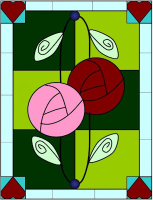
I was aiming for something to match my brightly colored Fiesta ware. Something streamlined, yet still having a period feel. Given the quirkiness of the dishes, and the fact I have a number of pottery heart molds hanging around, I decided to go with a Rennie MacIntosh (art and crafts period) meets Alice in Wonderland look.

This was my initial design...
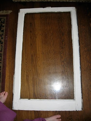
I bought an old plain window at Construction Junction architectural salvage today...
(Mind the feet.)

You'll probably all get a chuckle when I tell you how much it set me back. Can you guess?

No?

Well, how about $1.07?

I know; I had to ask the cashier to repeat that myself. Now that's the kind of cost I like in a craft project-- especially one that's an experiment that may go awry.

I still had some stick-on leading from my previous projects. So I started mapping out my design. Here we just have the border...
Now for the start of the MacIntosh roses...
As the piece started to take shape, it also started to deviate a little from my original plan. Not a bad thing-- sometimes flexibility is what makes a craft have character. Here you'll see where I have it now... Most of it is mapped out...
Once I'm completely happy with the design, I'll begin to paint in the color. That's actually the part I've been really looking forward to! But, as you can see, it seems to be shaping up all right.

I think I might cut out a heart shape from paper and try to get those hearts more consistent. It's been challenging adding them by just eyeballing them.

Anyway, that's where it stands. I hope to update you folks with it as it comes to a conclusion. Even if it doesn't work out, we can get some chuckles from the mistakes.

And as always, thanks so much for stopping by and sharing in the fun!

Transoms and Transformations

With a title like that, I probably should follow with a Jane Austen theme, shouldn't I? Ah, can't you see it now?...Pride and Prejudice... Sense and Sensibility... Transoms and Transformations...
"A cautionary social mores tale about a witty yet naive, upper-class 18th century young woman, designing stained glass windows the same way she pieces together the shattered love lives of those around her..."
Okay, so... no.

Fortunately, my actual stained glass window project was a little more successful than my knock-off Austen.

Yes-- when last we left the project, I was hoping to take the boarded-up window I'd inherited in my livingroom and stylishly add this...
To this...
Then I'd tried a gel stain (which you can supposedly paint on non-wood items, as well) in Aged Oak. One coat looked hopeful-- like this:
Unfortunately, Coat Two ended up looking like this...
Really dark and still not spread evenly. A third coat would have made it almost black. And black would have been the opposite of Improvement. So I shifted my gameplan.

I decided to paint over it with a lighter warm brown undercoat, let that dry, and then went over it in a darker brown topcoat. Then woodgrained it. Here's the dark brown coat...

And, would you believe a variety pack of haircombs from the drug store served as the appropriate woodgraining tools?

When done, I went over the whole thing with a clear Satin topcoat, to keep the shine down so it would match the rest of my faux wood painted baseboards. (Thankfully, it does!!)

Then came time to add the stained glass window panel. As the stained glass was a little smaller than the boarded up area, I decided I would faux finish the rest of the board to make it look like stained glass, too.

For each layer of "glass" I used a light paint and dark paint in the same general color palette, and blended while wet.
So here are the edges all taped off and painted. Uneven gradations and variation will help make it look more like stained glass (I did a lot of staring at real stained glass to figure out how it worked!)...
Now the inside. We tape off...
And add the green. This is a combination of Forest Green Folk Art paint and some leftover wall paint from this room. That color is called "Celadon" by Eddie Bauer, in their Craftsman collection.
Now we move on to the middle block to surround the arced stained glass. This was done in some of the tans for the first layer, along with some of the brown used for the window frame. The corners also got a little pop of red...
And here I fit the stained glass panel into place, to double-check that it fits.
Last, I used some stick-on craft leading I'd picked up ages ago for another project, and added them in, extending the real-lead lines of the actual stained glass window in to the new faux ones.
And voila! Completed window!

Oh wait-- let's not forget the McCoy vase collection to match!...
Phew! I'm kinda tired now! Where's Mr. Darcy? It's time to take a nice, quiet night off.

Thanks for bearing with me everyone, while I completed the project.

And I hope you all have a marvelous rest of your week.

Treasure Box Wednesday: Treasured Transformations

To indulge in a little personification for a moment, my house lately must feel a little like Cinderella-- post-fairy-Godmother-makeover. In the last month, two rooms have gotten a very new look, and I'm pretty pleased with the results.

Over the weekend, I painted my bathroom that Baby's Breath Pink I showed you all on Sunday. So here's what it looked like Before...
A fresh aloe green, yes. But I was finding it very hard to match to any green accessories these days. Bathmats were more sage or avocado or mint, and tracking down items that would work was a little frustrating.
Also, I had that rich-colored shower curtain I really wanted to use for the winter. So my brain began plots of painting pinkness.
You can see the gold art nouveau styled mirrors and accessories here. These will mostly remain as part of the decor after...er... Cindy's fairytale makeover.

And here we see it in the pink!
The room now has a whole different feel, I think. Where it had felt rather open and fresh before, it feels a bit more sumptuous somehow now. Which is funny because the drapes, mirrors, and ledge shelves are all exactly the same...
Here you can see I swapped a couple of Alphonse Mucha resin plaques-- in a color too orange to really work for the room, for a mosaic vase I thrifted. The crystal items in the vases are actually Christmas decor from K-Mart from last year's post-season sale.
And here you can see the pink with the black trim and the nifty shower curtain. Everything ties together better now, I believe...
And just another last shot, by the pedestal sink.Now, for those of you asking to see the rest of the blue French room I'd been working on, here's where we are...
Most everything is back in place. I've hung a mirror here at left, which has opened things up a bit more and given it some extra shine. (And yes, I had been sitting on that sofa with a magazine... bliss!)
This lampshade I ordered through Ebay. It has courting couples on it much like the sofa cover...
You'll see it's on my thrifted alabaster lamp from a week or two ago. I wish these types of shades were a little cheaper, but even the cost of fabric would be high for something quality. I'm not currently skilled enough to make something like this myself. So this was a splurge.

Over here, I'm still working on this area...

The little Shabby Chic bookcase from Target has my Victorian postcard collection albums in it, and some books I enjoy leafing through. I'm still trying to find just the right combination of accessories. Given both of my best friends who I shop with LOVE blue, I've discovered that I don't actually have much in the way of this color. The bright blue glass shoe in the upper right was a thrift store buy yesterday, actually.

So, that about wraps it up for today.
And if not-- hey, there'll be new goodies this coming Sunday. Hope to see you then!

Choosing Wall Paint You Won't Regret

What is it about choosing wall paint that somehow ends up seeming like a deep, painful decision akin to Kennedy's pressures in Cuban Missile Crisis? I mean, it's just paint after all. Color. Something to slap on the walls, right?

And yet anyone who decorates knows it's so much more than that. It's an atmosphere. A mood. It surrounds you. And most of all... it's a commitment.

Oh sure, it's not like deciding to get married, or to move across the country. But these days paint isn't exactly cheap. So when you invest in your half gallon of the stuff, you want it to work.

So how do you choose paint that will really work for your space?

Well, I may not have all the answers. But I've learned a few things over the years that have made choosing a good color easier. And I'm happy to share them with you today.

  • Don't try to decide on a paint right there in the store. Get paint swatches... and lots of them. The lighting in the paint store is not like your home. And it's the light that makes the difference in how a color appears. So make sure your take some paint swatches home and see what it looks like held up to the wall you'll be painting. This leads to the next point...
  • See what those swatches look like in all different times of day. A paint swatch that can look terrific in morning light might look washed out at midday and take on a strange glow toward evening. Live with the colors a bit and see how they look and change. This can help you narrow down your choices.
  • Remember that what looks very pale on the swatch card might look much bolder as paint on your wall. How does it compare to the furnishings you plan to have in the room? Remember the darker the color, the closer a room will feel.
  • You can get test pots of paint made up in the colors you like. Spreading a sample of the actual paint can help you get a better sense of what it will be like on a grander scale. This won't necessarily tell you how dark or light a room will get from painting. But it will give you a feel for how the paint will look at different times of day.
  • Think about the color itself. Does it lean toward cooler or warmer tones? For instance, you might say my Baby's Breath Pink above is just pink, right? But it's actually a cooler pink-- a purple pink-- as opposed to a more orange pink. The fact that it's a little more toward the blue spectrum of things instead of the hotter orange reds means it will go better with the eggplant and raspberry rugs I have in the room. By knowing whether your color leans toward cooler or hotter tones, you will have an easier time coordinating it to other colors.
  • Once you paint, live with the color a few days before passing final judgment. A change of color -- especially if it's drastic-- can take getting used to. The room may seem cozier (or more claustrophobic!) or the color may feel like it's really opened up the room. So give yourself time to get used to the change, and really experience the color in situ itself.
The world's a bright beautiful place-- too beautiful to live without color. So don't be afraid. We all get a little nervous when it comes to making a paint selection. (You can click here to check out the tale of paint panic I had the first time I tried to paint a room!)

Just take your time. Think about your colors...

And then carpé paintbrush!

Wishing you good fortune and great color for all your future painting endeavors.